

This post is sponsored by Metrie. I’m sharing why you may want to consider a darker, contrasting trim color for your walls, as well as how to choose the right shade for you and your home!
When choosing the colors for the walls and millwork in our Two Flat, I knew one thing was for sure, and it was that I wanted to incorporate contrast trim! You may recall that we were initially hoping to salvage much of the original trim in the home, and while we were able to save a lot of it, we ran into several issues when it came to stripping off the old paint. We started to think, Is all this effort worth it? Would our time be better suited elsewhere? Our answer: No and yes, respectively.
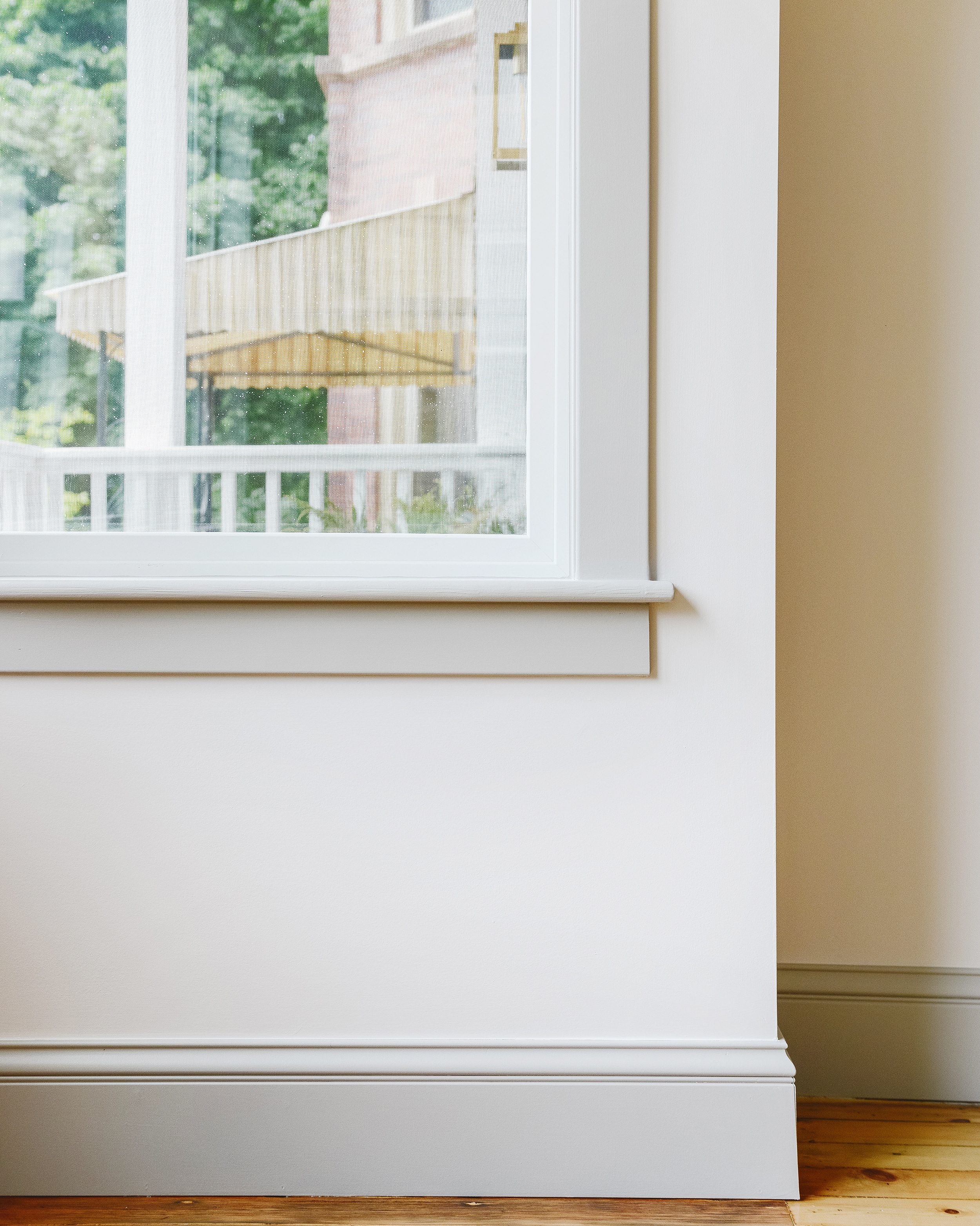
Instead, we turned our energy towards sourcing millwork that would replicate the historic charm that had us falling in love with the Two Flat in the first place, and we found everything our hearts’ desired with Metrie! We were able to use baseboards and caps to create near-identical extra tall trim, and we paired door and window casings with stops to provide additional detail. We shared more about that process in this post, but here’s a list of all the products we used throughout the home:
- Baseboard
- Baseboard cap
- Vertical door casing (This is actually a chair rail!)
- Vertical window casing
- Horizontal door/window cap
- Horizontal door/window door stop detail
Why try contrast trim?
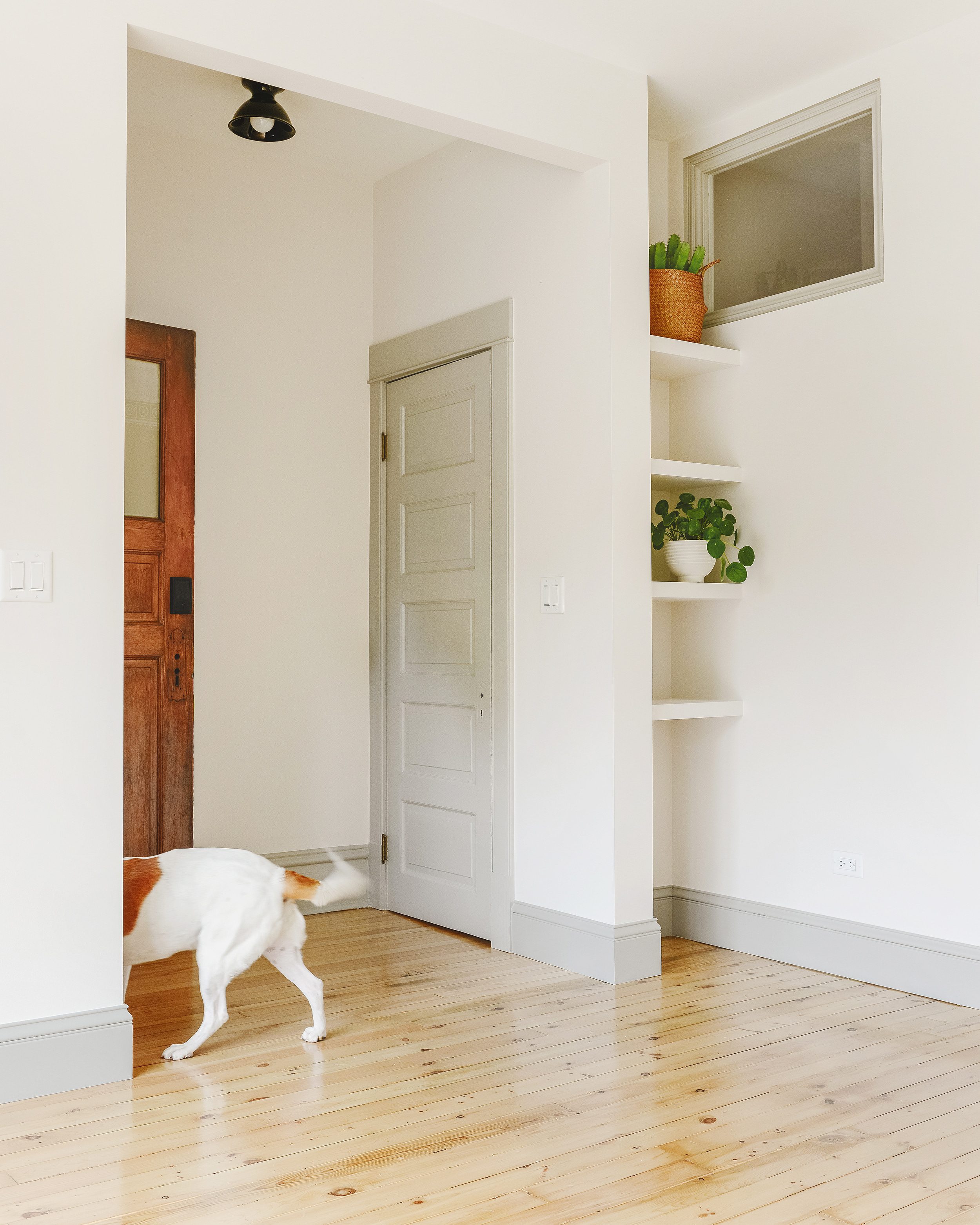
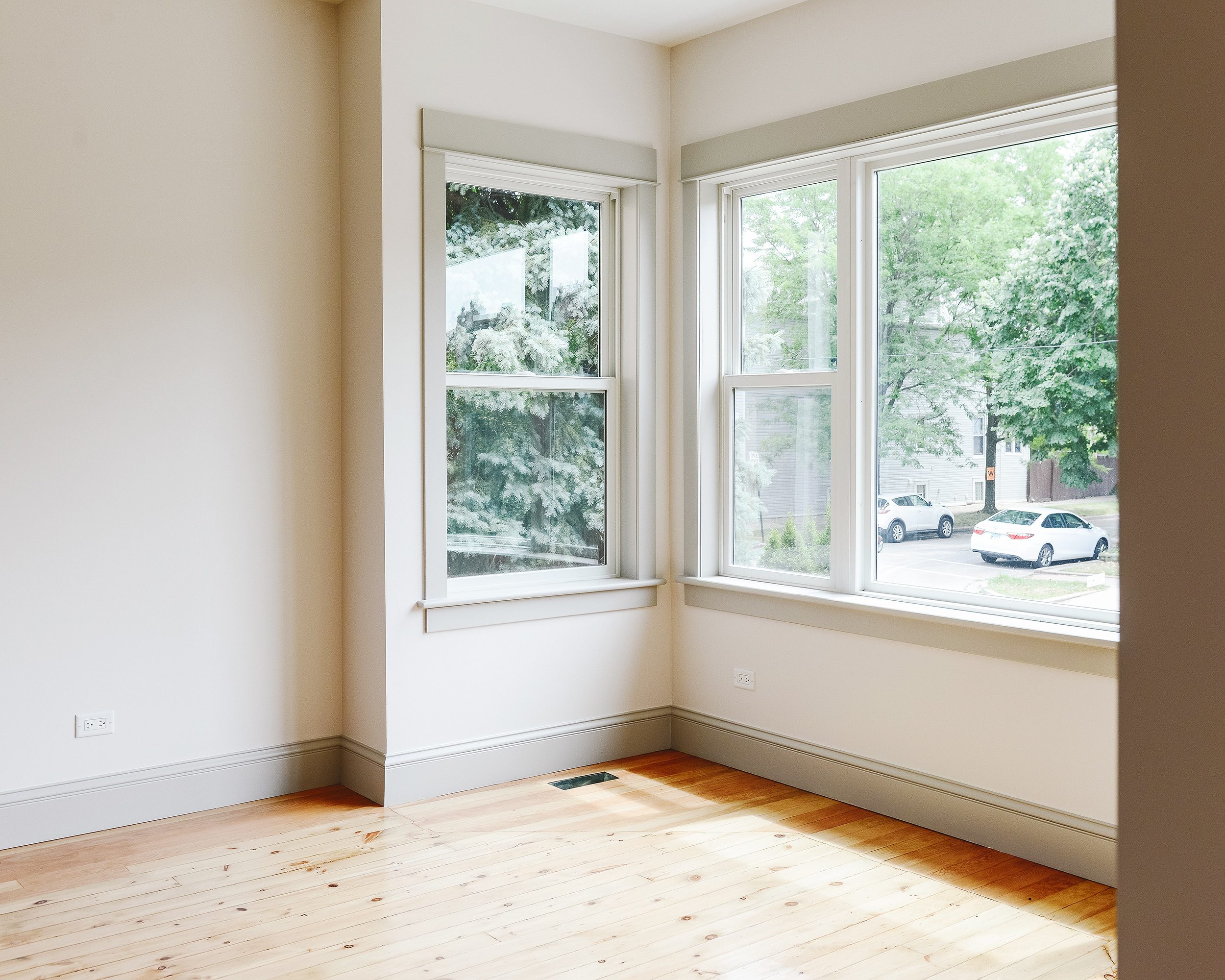
Our answer to this is simple: We wanted to show off our millwork! Rather than painting all of our trim white, we opted to find mid-toned greys that would add depth to all the Metrie millwork that was installed.
Another fun reason to choose contrast trim? Think of it as framing your view – whether it’s the window frame that overlooks your garden, or the doorway that leads into your dining room. The deeper the contrast, the more striking the color, the more bold the look!
Choosing the Perfect Shade
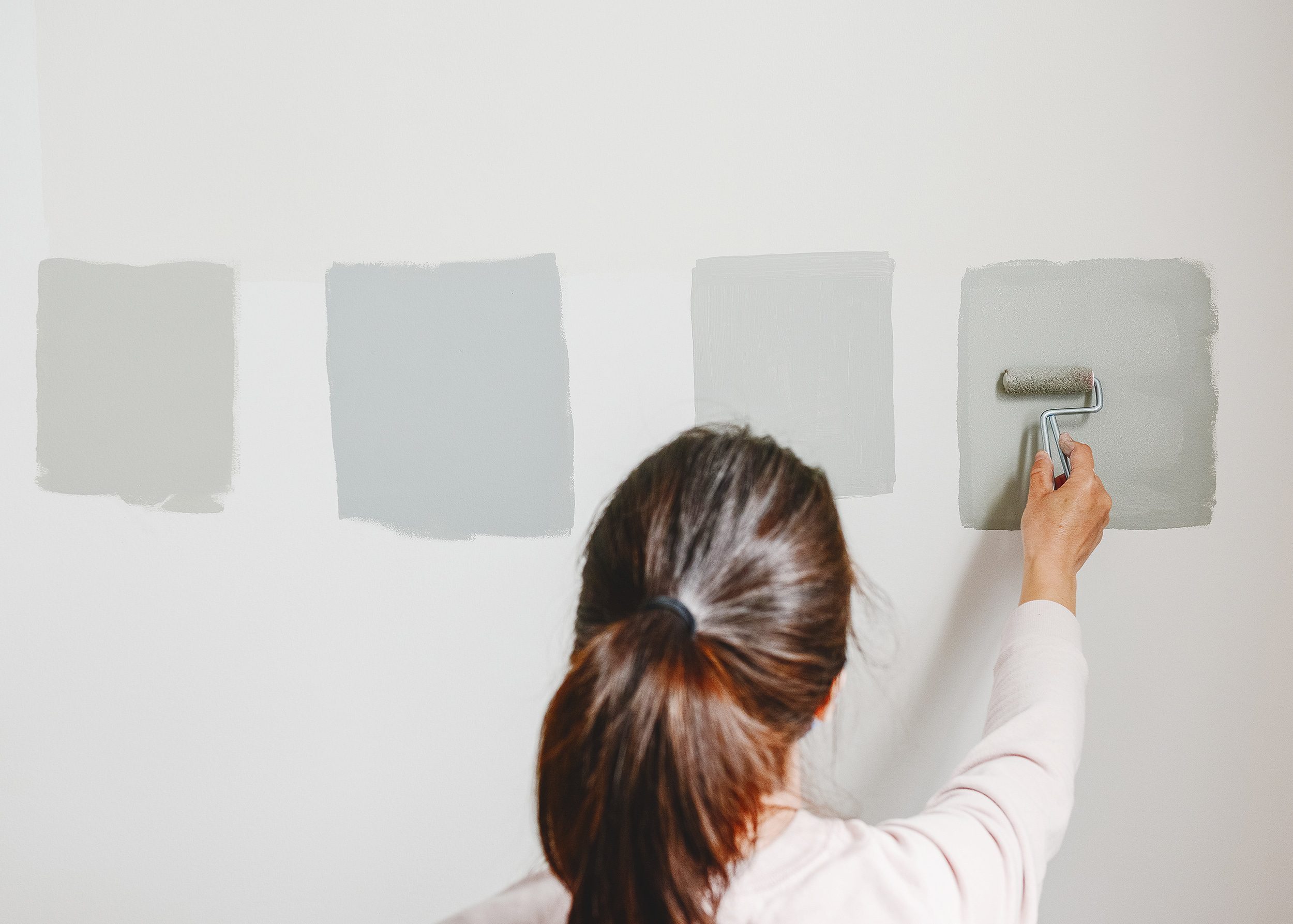
Did I overthink the process? Absolutely! (Hi, I’m Kim, and I overthink everything! Like, everything.) But once I was able to narrow down a color family – greige for Unit 1, cool/blue grey for Unit 2 – I could feel myself picking up steam and getting closer to the goal I had in mind. Scott and I both knew we didn’t want anything too saturated, so I was careful to stick to ‘muddier’ shades from my paint deck.
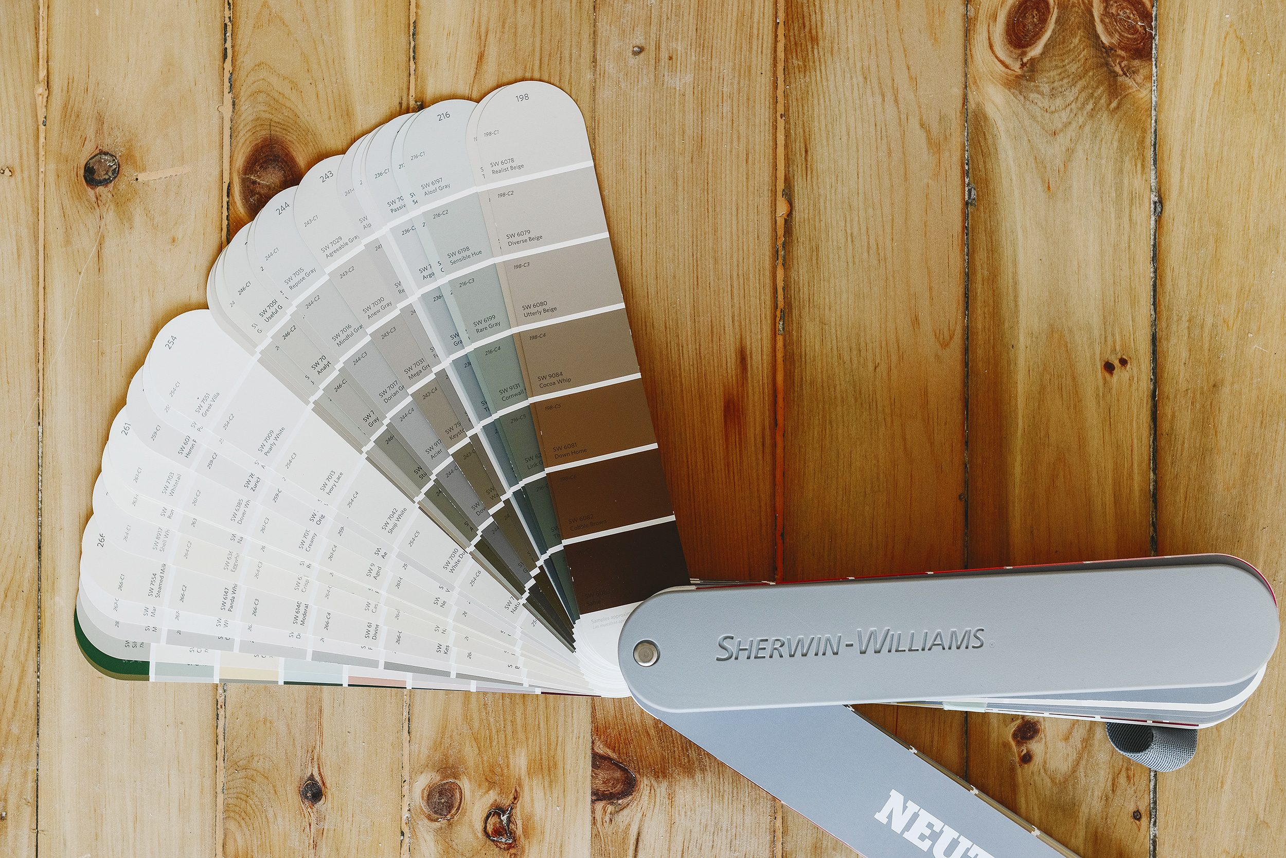
I ended up picking up 10(!) sample pots, which included a few warm whites for the walls. I painted those swatches from room to room, and I considered the light each space receives. If you look at the image of my paint deck above, I opted for the shades about a third of the way down each strip, many of which had a light reflective value (LRV) of 70-ish.
Note: I don’t want to get too in the weeds talking about LRV, but I highly recommend checking out this article! LRV is measured on a scale of 0 to 100, with 0 being black and 100 being white.
And the Winners Are…
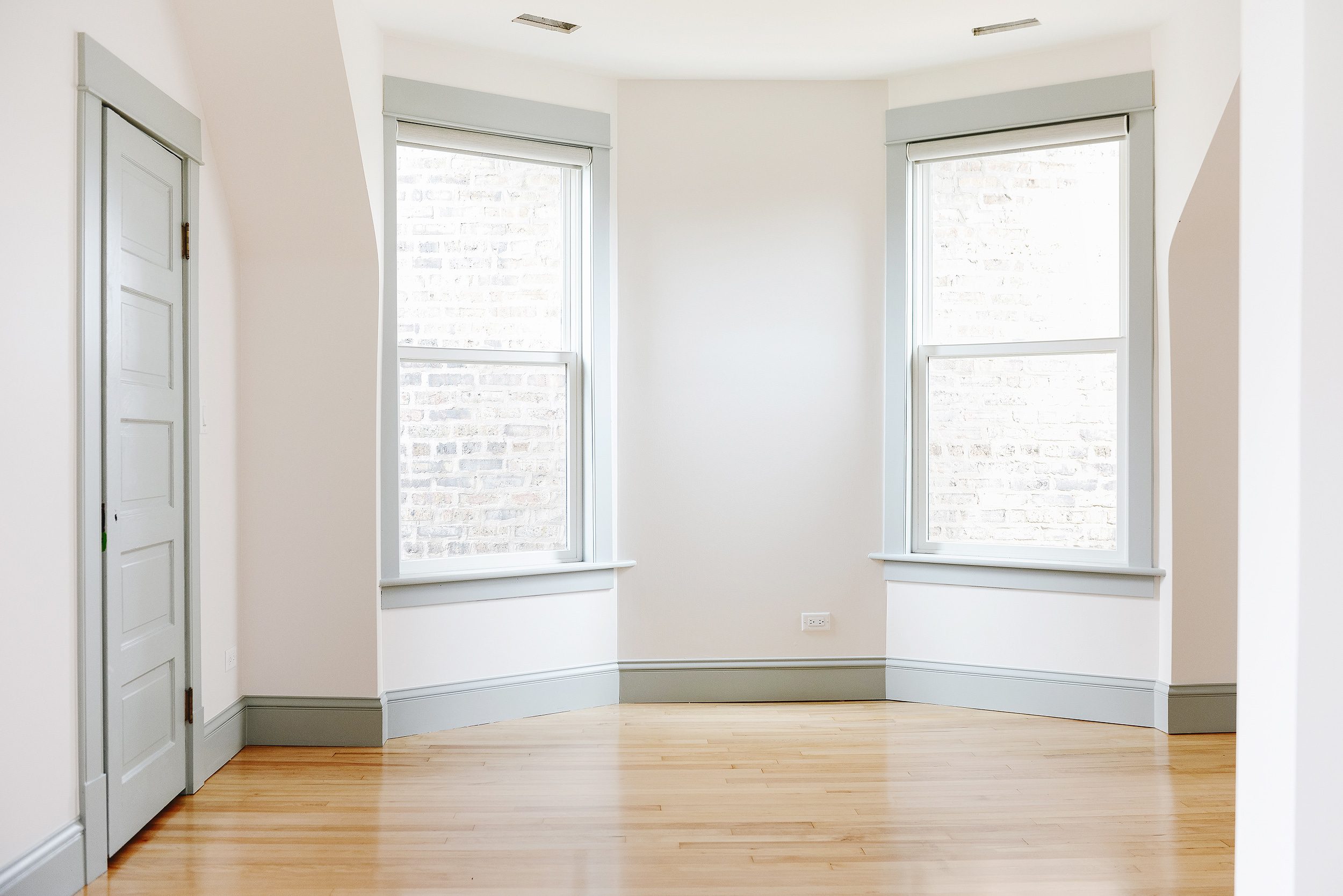
We found our perfect pairings for each unit after studying the swatches over the course of several days, at varying hours. We ultimately chose the same wall color throughout the entire home, Sherwin-Williams Heron Plume SW 6070. It leans ever-so-slightly pink at certain times of day, but it also travels well from room-to-room and suited each contrasting trim color so well! Here’s where we landed:
Unit 1 | Walls: Sherwin-Williams Heron Plume SW 6070, Millwork: Colonnade Gray SW 7641
Unit 2 | Walls: Sherwin-Williams Heron Plume SW 6070, Millwork: Magnetic Gray SW 7058
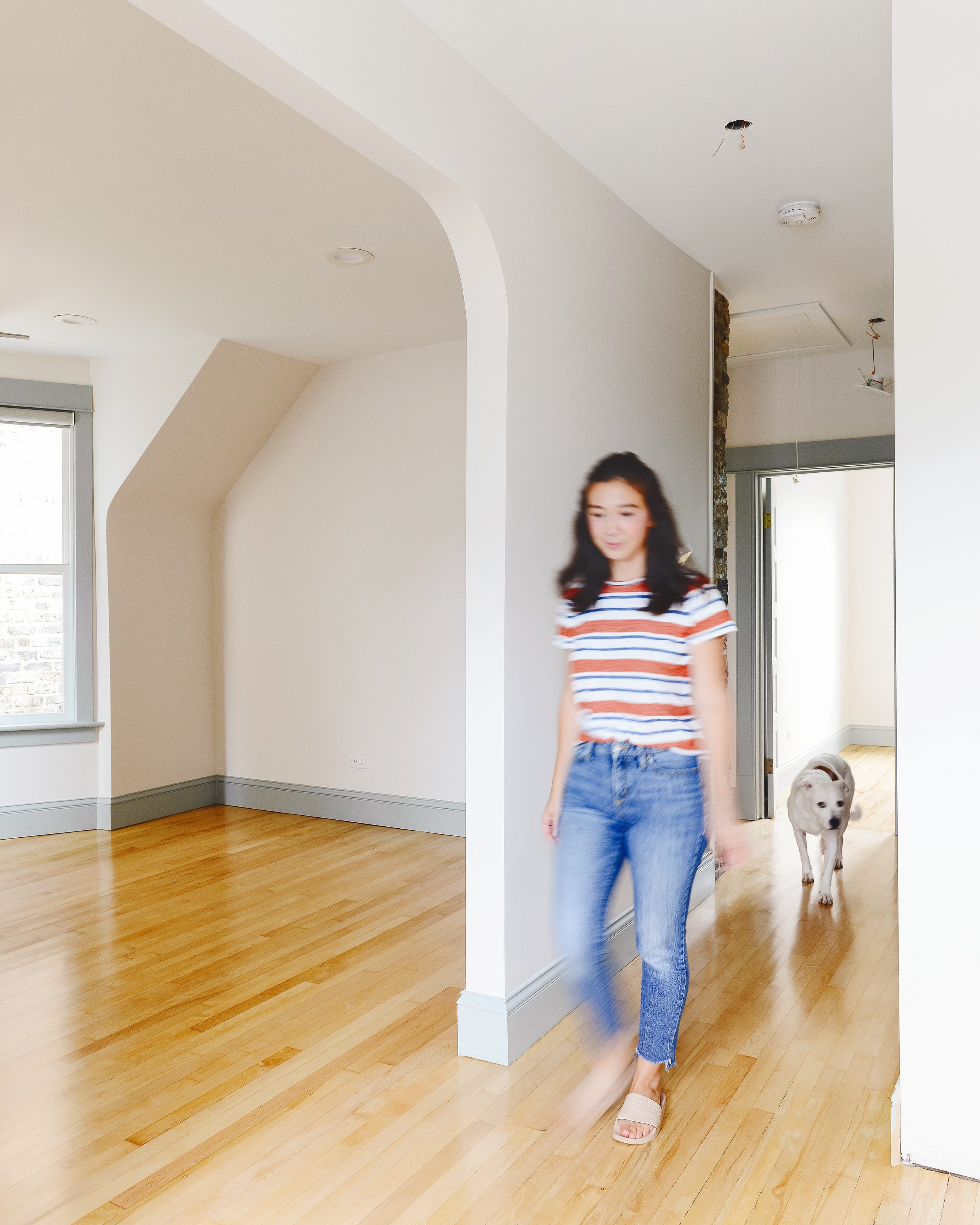
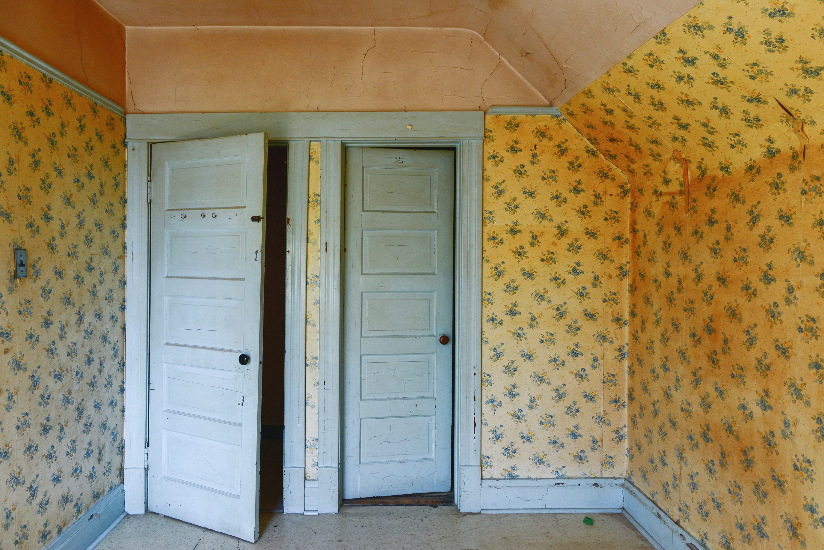
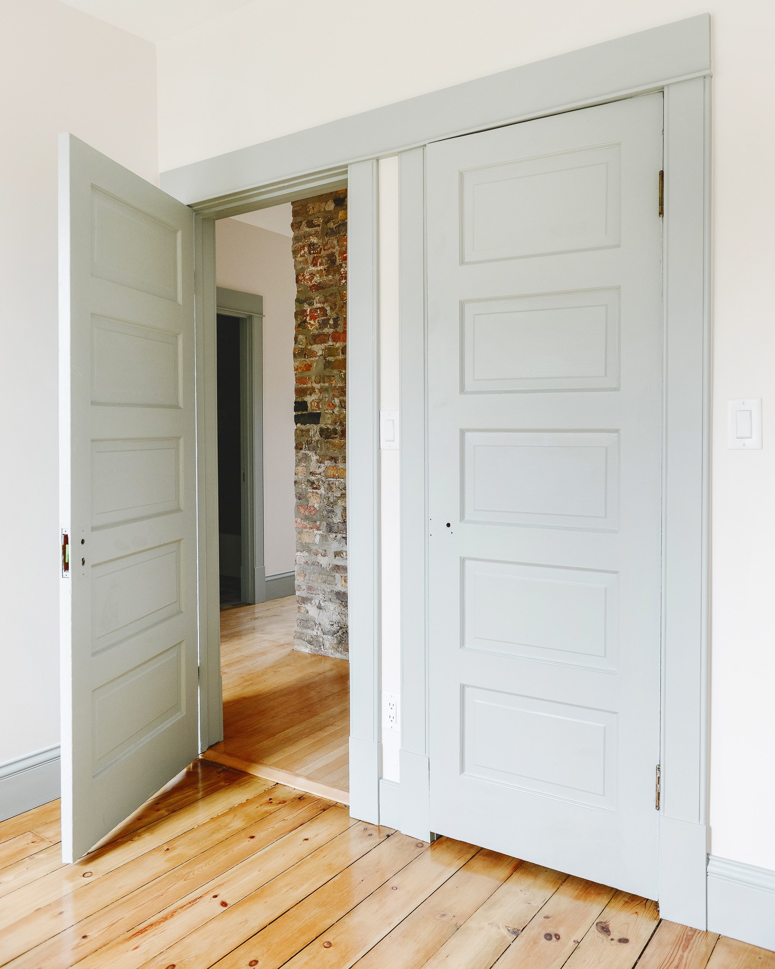
If you remember, the entirety of the second floor apartment originally used contrast trim! Here’s how one of the bedrooms looked last year, before we started our renovation:
And here’s how it looks today! This was such a fun way to honor the previous homeowners’ decision for contrast trim. Similarly, we knew we wanted a color with enough blue in it to make a statement, an ode to those who lived in this house before us.
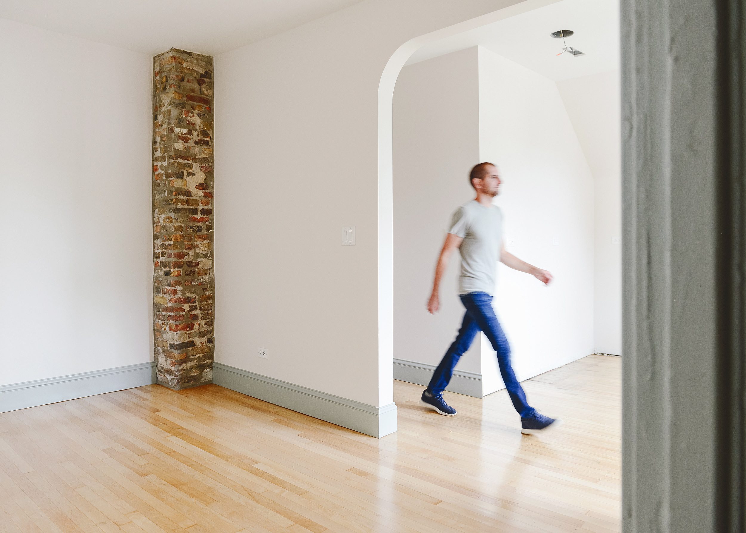
We are so happy we took the plunge into the world of contrast trim, but we’re especially happy we did so in a home that was outfitted in head-to-toe Metrie trim. The subtle detailing in the millwork is a beautiful complement to the vintage doors throughout. Every length of trim, every color choice and each brass-y hinge play together in a way that feels fresh and fun, yet still traditional with a nod towards our home’s 130-year-old history.
So tell us, are you Team Contrast Trim, too? Drop a reply in the comments below, and let us know if you’ve already used this look in your own home! If so, which colors worked for you?
PS: You can follow along with the Two Flat renovation from the very beginning right here, if you’d like, and we update this page with every new post about the renovation. Thank you for following along, and thank you for supporting the partners that support us! Find your perfect millwork with Metrie right here.


There’s something about contrast trim that leans blue that reminds me of historic homes (colonial Williamsburg comes to mind!). Anyway, I love it when done well, which you’ve certainly done. In our own home, 2/3 of the original house (built in 1930) still has unpainted/stained original heart pine trim, and I don’t think we’ll ever paint it. The sunroom used to have bright mauve trim, but we went white there. :-)
That sounds beautiful! Even the mauve, which we know isn’t for everyone. ????
Cheers to contrasting trim!
Looks great!!!! Trim is such a lot of work but makes such a big difference. We have magnetic grey in our dining room and it’s beautiful. Skews a bit green in our house.
Interesting! Ours feels like a true blue. Only further drives homes the point that paint will look different in every home, every room.
While I love a crisp white (!), this trim is beautiful, I think I could do contrasting trim after looking at this. The millwork is subtly beautiful!
We are remodeling the first floor of our former duplex (I don’t know why in Chicago it’s called a two flat, but in STL it’s a duplex!). After seeing you (and ISpyDIY) do this, we are planning to use the contrasting trim primarily because I think it will help hide dirt. White baseboards means more cleaning! The two flat looks beautiful. Well done!
Haha, an unexpected ‘pro’ for contrast trim!
this post made me so appreciative of all the extra work and time and thought you’ve put into honoring and celebrating this house, and all its character and history. On behalf of those of us who find the past worth saving – and appreciate reusing instead of discarding the past – but also understand at least part of what that takes!! – Thank you! the results are just stunning.
“(Hi, I’m Kim, and I overthink everything! Like, everything.)” I’m dying. This is literally what will be put on my tombstone.
Twin Kims! ????♀️
I am a fan of contrasting trim. You’ve done a beautiful job. I really do not care for the painting-trim-same color-as wall trend. It tends to make the walks look flat and uninspired.
love the contrast trim!! is it possible to do contrast trim in just one room (master bedroom) or do you need to do the entire house?
Definitely possible! We have contrast trim throughout ALL of Unit 2, but in Unit 1, it’s only in the main living room!
I never knew contrasting trim was a thing until recently but, after seeing so many beautiful projects using it (ispyDIY, CLJ and you), I am TOTALLY here for it!
????
Slightly different question from Trim, Do you plan on completing a certain unit first and continue to work on the other? You could start renting before outfitting the details of the short term unit. Remind me one more time which unit is short and which is long term?
Yup, you nailed it. We’d like to finish unit 2 and get it rented yearly. Then we can finalize unit 1, which we’d like to turn into a short term rental.
I think dark trim really works best with an older home style, like this, or like Hannah says. I learned from one person who restored an old home from the 1600s that in that period the didn’t paint the plaster – maybe couldn’t, even, with the paint and plaster technologies of the time – so the trim and woodwork was the thing they could paint, and they painted it darker colors than the plaster.
That’s so cool! Love that, thank you for sharing.
That looks great! My mid-century house doesn’t have a lick of trim molding anywhere – no base, no crown, no moldings around windows or doors – just a narrow reveal of the framing posts and beams. Those are all stained dark so I’m not lacking contrast!
[…] have always gravitated to white trim in a home, but this is making me consider something […]
Both shades look fantastic in each unit. I’ve been seeing this trend pop up here and there, and if you have nice millwork to feature, I say go for it! I barely have a baseboard, much less any other decorative trim, so I will find other ways to bring contrast to my home :)
Hi Kim! If there had been crown moulding in these units, would you have painted it the contrast color or kept it the wall color? Trying to figure this out now for our house. :)
Hi Annie! We would definitely have painted crown moulding the same color as the rest of the trim. Hope this helps!
Thanks so much!!
I am so excited to do contrast trim in our home! We had the same issue— tried to save trim from 1925 but just wasn’t possible. Our contractor did an incredible job mimicking it and I want to showcase it throughout the house..
My issue is that I want to use a nice warm white on the walls, but for budgeting we went with bright white kitchen cabinets. Do you think we can do a warm white on the walls with stark white cabinets?
Absolutely! We have warm white walls with white kitchen cabinets. It provides subtle contrast.
I love this look! Can I ask what finish you chose for the trim? I’m using this for inspiration. :)
Did you use flat paint or gloss? Looks great!
Satin for trim!
Hi Kim, my wife and I are thinking about doing a dark gray trim and white walls. Our question is do you think that’ll look ok with white vinyl windows? Halp…
We prefer a slightly lower contrast if the windows are white, but that’s just our preference. Hope this helps!
Hi, Kim! I have a 1908 colonial with its original trim and I want to paint it a contrasting color but it’s got several layers of paint already. Did you refinish your trim or replace it? Thank you! Love this post ????
We needed to replace it. And thank you!
[…] Elle Decor Via Yellow Brick Home Via Town & Country Living Via Room for Tuesday 0 Share […]
I love contrasting trim and I’m considering it in my home. My only concern is what do you do to bedrooms/bathrooms that don’t have white walls that would work with the contrasting trim? Is it okay to have the inside of the door a different color or even white to go with the bedrooms vibe?
Yes, that is 100% ok!
You did an absolutely stunning job in your home. The color combination is beautiful and it makes me want to do more contrasting trim in my own home. I have a question-what color did you paint the ceilings? I’m worried that if I do a ceiling white, it’ll be too many differing colors.
Hi Sara! We’ve been slowly eliminating ceiling white from of our spaces. We almost always paint the ceiling the same color as the walls. In our experience, it helps the room to feel larger and more cohesive. This is especially true when the trim isn’t white. Hope this helps!