

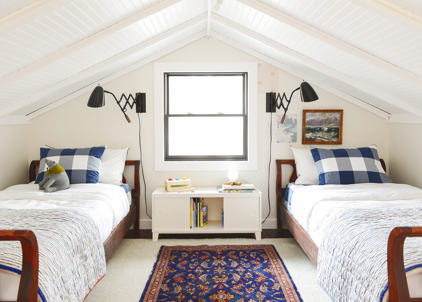
check sheets | sconce | vintage rug (similar) | wool rug | bookcase | art | night light
It’s official – choosing wallpaper is not for the faint of heart. Ha! Never have we received more messages on a series of Instagram Stories than when we’ve shared our wallpaper debate. Like, ever. We love how intuitive you all are, and although we were initially leaning towards several of these pretty papers from Kate Golding, you could read me like a book. They’re gorgeous, but not for us. Not for what we had in mind.
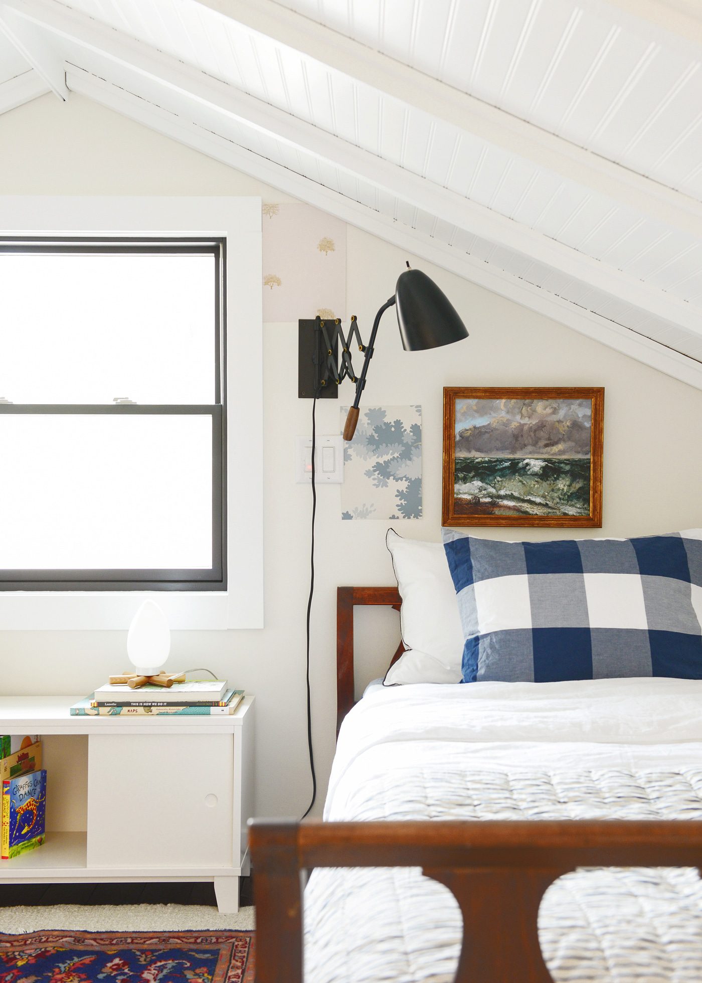
Our idea is to wallpaper the window wall in the sleeping loft. While we’re not typically drawn to accent walls in a large room, we do think there’s something sweet about them in cozy nooks – like our guest room, for example. They can help to make an awkward wall feel intentional (ahem, guest room) or enhance an architectural detail you love (the sleeping loft ceiling!). We know we want the ‘theme’ of the paper to feel right for Tree House – and you probably noticed this. Our paper focus was mostly on nature themes – floral, greenery, sand dunes and forest friends. It is a kids’ space, after all, but that doesn’t necessarily mean we want it to feel kid-ish. We think there’s balance to be found, if only we can actually find it.
Psst: There’s a poll at the bottom of this post where we want you to weigh in!
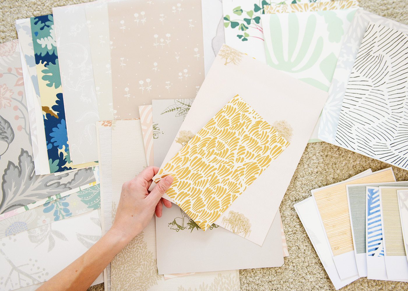
Over the last few weeks, these are all the samples we’ve collected, many of which come in several colorways, some of which you can see represented above! Over the course of sharing our process with you over Stories, so many of you requested a round-up of our samples. I’m only including one color option in the round-up below (because, sanity), but most – if not all – have many, many other colors available.
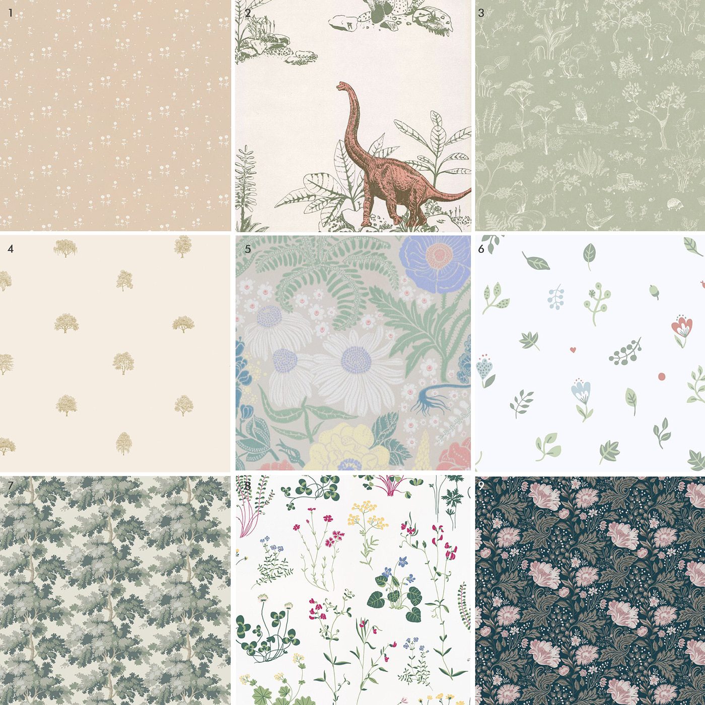
1. bianca | 2. classic dino| 3. hollie | 4. arboretet | 5. lisa | 6. hillevi | 7. raphaël | 8. simons äng | 9. ava
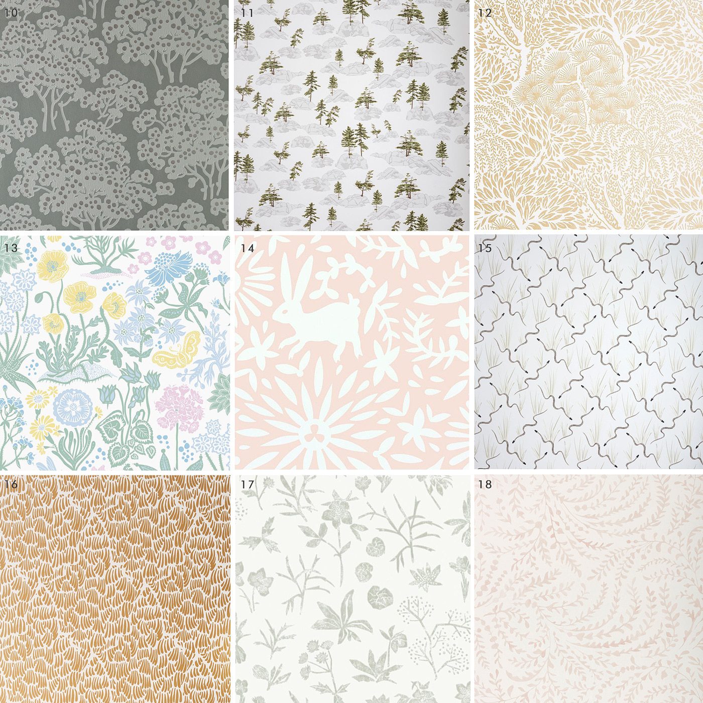
10. hornbeam | 11. canadian shield | 12. miyuki | 13. lotte | 14. jardin | 15. garter snake | 16. gaar | 17. johanna | 18. priano
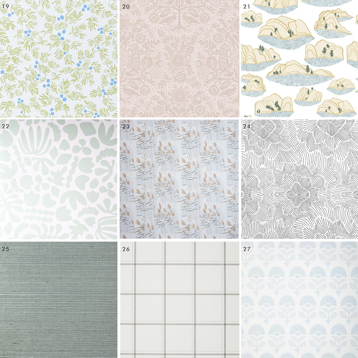
19. juniper summer | 20. mika | 21. sand dunes | 22. muse | 23. grasses dawn | 24. pinstripe floral | 25. grasscloth | 26. hammonds | 27. larkspur
check sheets | sconce | vintage rug (similar) | bookcase | art | night light
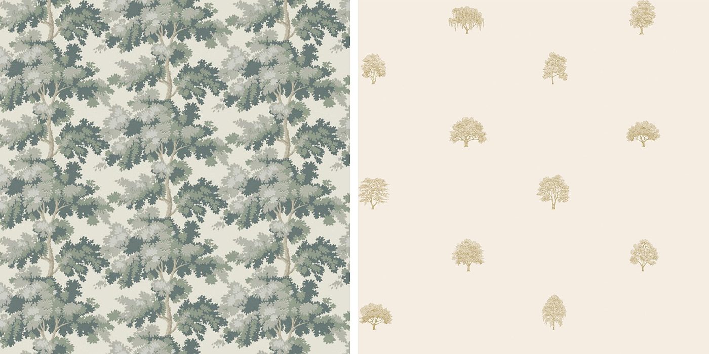
In the end, we have both fallen for two papers, Raphael (seen in blue, above) or Arboretet, by Sandberg. The problem? We love them for entirely different reasons:
#1| We love, love, love that Raphael draws your eye out that second floor window, where you see the tops of trees and lush greenery. The cream backdrop perfectly mimics our wall color (Ben Moore’s Cloud White), and we think it would envelop you into a cozy, tree-lined nook.
#2| But! We love, love, love that Arboretet is subtle and soft, with a barely pink backdrop. It invites you in, asks you to take a closer look. The illustrations are so intricate yet small, and the restraint in the design feels relaxing.
#1 | #2
We’re hoping to choose and complete the task in the next month. Which would you choose? (No write-ins allowed for a reason, our brains couldn’t handle any more indecision.)
In This Post:


Okay I thought you had made a mistake with Raphael because there was NO WAY that sample on the wall was the same as the picture you were showing. I went back and forth looking at the two so many times. And then I realized that the trees are a lot bigger than I was expecting and the sample image was zoomed out. That made me love it so much more. I think the scale is perfect and will look so so cool up there!
Oh wow, thanks for saying this because I was totally baffled as well! I love that one!
It’s true, the scale is much larger than my zoomed out #1 sample shows. It’s pretty dreamy!
Thanks for this clarification as I was confused as well! The sample on the wall almost looks like camouflage. If the scale is that large, I hope there’s enough wall to allow you to really see the tree motif. I think the blue of the Raphael goes much better with the colors you already have going on in the room. The pink feels out of synch.
I had a similar reaction. I liked the Raphael but thought it might be overpowering. When I realized the scale from the sample the vote was easy. Raphael in the blue.
I don’t care for the Aboretet in that context at all, although I like well enough as a sample. I think it will be too weak for that particular accent wall.
I went with Raphael only because I feel like the pink makes the white/cream of your walls look dingy and that is no good! Both are fab.
Ooh, that’s an interesting point.
Two great options but boy do I LOVE Classic Dino!
I’ve always loved the Dino! I’ve been trying to make it work for so long – maybe for Lucy when she’s older. :)
Raphael is my choice. It will complement your beautiful ceiling as well as the window view. Can’t wait to see it finished.
I chose Raphael, even though I prefer Arboretet, because I feel that Arboretet will looks like large dots from a distance. The print is too subtle for this space I think. Good luck making a final decision!
Definitely Raphael. And I like that you have it up in the blue version – the green version would be too much like being in a forest, which you don’t need to replicate inside as you have tree views outside. Being in blue, it turns from being a more realistic depiction of leaves to a decorative abstract pattern bringing leaves to mind – more cozy in blue than in green, which feeling forest-like could feel overwhelming inside. And I thought the blue swatch looked perfect up there (and a nice backdrop to the landscape paining nearby) as soon as I saw the photo with your two swatches up, even before I saw the other swatches.
The Arbortet is nice in itself, but the scale of the trees strikes me as too small for this space. Plus the small scale of the pattern brings to mind very traditional wall paper, which is the look when you first see it on the wall before you get close enough to see it is trees – it looks from a distance like very traditional, stuffy-room-decor wallpaper, which is not the look for this vacation house. I could see it working well in a much smaller room, like a powder room or bathroom – both because of the small scale, and because you are only ever close close up to it, so you always see it as trees and never see it as just small patterns spaced out on a wall like you do when you see it from further away. (I also agree with the person who wrote that the pink makes the rest of the paint in the the room look dingy.)
This room demands a larger scale pattern, in my opinion, and one of leaves rather than whole trees, given its second floor status. I have a mission sofa upholstered in fabric with gorgeous oak leaves, and I’ve never, ever tired of it. You can’t go wrong with gorgeous, full-sized leaves, I think. The wood of my sofa frame, like the wood of your bed frames and painting frames, supplies the look of the tree trunks – all you need to add are the leaves.
Thank you, Ann! I’d love to see a photo of your sofa, if you have one? Sounds beautiful.
Would the Arboretet look like polka dots from farther away? Not saying that is a good or bad thing, but something to consider as you are coming up the ladder.
I like the scale of Arborete, but prefer the colors of Raphael (for this space with the existing bedding/rug/etc). The pink with gold trees is beautiful, but gets too washed out on this wall. Do you have another color with a little more contrast?
Definitely the large scale of Raphael!
Are you going to caulk those gaps between the beadboard ceiling and the beams? Those dark gaps stand right out with everything else painted that lovely cloud white…
I voted Raphael, mainly for the coloring though. However my own penny in the pot is hopefully when more of the pattern is up on the wall, it comes off more like trees. Right now, just using the sample, from far away it almost comes across as blue camo if you’re not really focusing on it.
I’m personally really taken with the Arboretet sample. There’s a great tranquility lent in its subtlety. Also, I’m getting a sense of airiness in the same way I do when you’re exploring Treehouse in your posts. As an aside, size wise, I think the pattern is really rather visible. Regardless, I’m sure the wall will look gorgeous no matter what you guys decide!
Raphel. I am putting the same paper in my guest room (black/dark green colorway). It is so lovely and looks much more expensive than it actually is. Interestingly, I got a sample of the Arboretet as well. Cute, but i wish it was screened vs print. It just doesn’t look as high end. I wasnt digging the texture of the paper either-seems like it would stain and mark easily.
I just did my bedroom in raphael in blue and i love it and its not overwhelimg at all. if you want to see it email me i’ll send you a pic!~
I’m another vote for the blue Raphael which I think looks lovely and soft and perfect for that wall. Arboret would be nice for a whole room but I think it will look very so-so on just that one wall. I agree about the slight pinkish background maybe looking dirty against the white in the room.
Take one vote off Arboret in your poll and add it to Raphael because I accidentally clicked the wrong one ?
Do you have a preferred wallpapering how-to resource? We purchased wallpaper that requires glue installation and are struggling to find a good how-to. Thanks!
We got you! Here’s our paste tutorial: https://yellowbrickhome.com/cities-in-the-guest-room/