

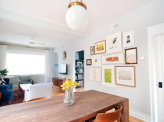
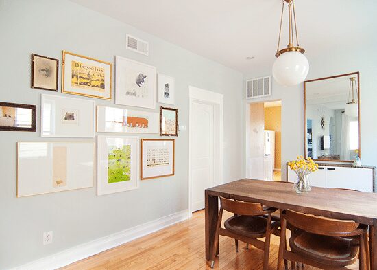
With the addition of a few new photos and on-hand art, we swapped out our (not that) old gallery wall in the main room for something larger and with a bit more contrast. The change isn’t huge, but man, it really makes a difference in the room! I’ll be the first to admit that I’m a full blown fuss-er, but even Scott was on board with a little change up simply by not disagreeing with me. (Marriage; you pick and choose your battles, right?)
You’ll notice that the same art from Wall One was mixed back into Wall Two, and with a handful of new frames, the look feels more collected overall. While we love cohesion in frames, after living with it for a few months, it didn’t feel right in the space. Now? It does!:
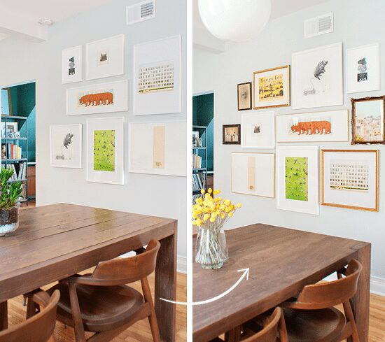
The original wall of art was all Ikea Ribba frames. We love, love, love a good Ribba frame as much as anyone, but the larger frames had started to sag (which is really bizarre, considering they were a-okay in our old home – weird!), and I was itching to incorporate our Elkhorn Flea frames. After printing a couple of my own photographs and re-thinking the frames for a few of our current favorites, we ended up with a collected and layered mix. The new configuration is providing more contrast against our soft walls (which, as you know, we’re not quite sold on) and warming up the room with our favorite – gold!
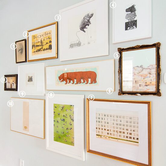
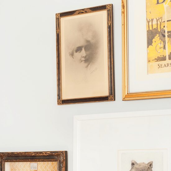
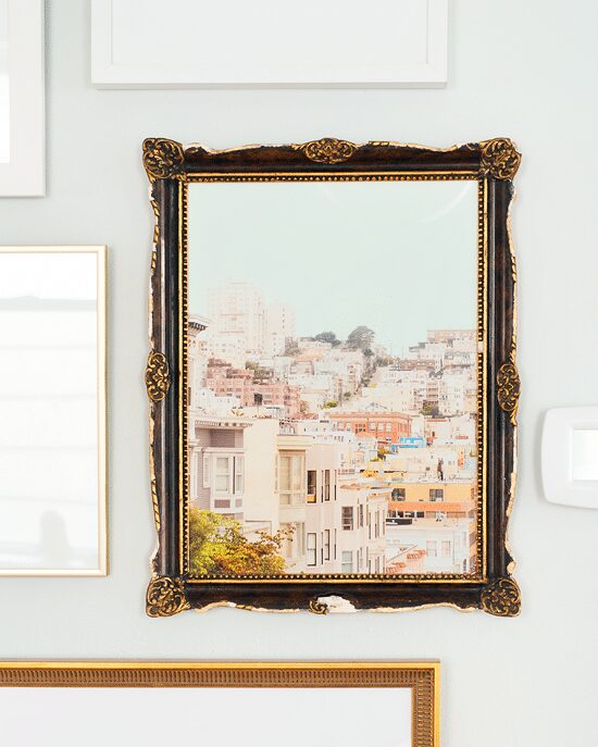
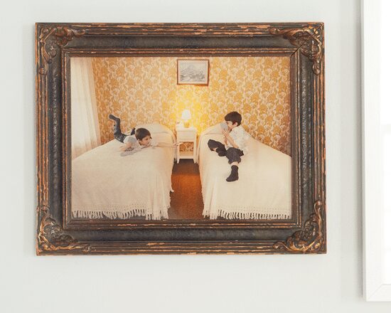
ONE Vintage photo and frame // TWO Bicycles print (a wedding gift) // THREE Artificial Growing, Ricardo Solis // FOUR DIY screen print made at a local arts festival // FIVE San Francisco #2 // SIX bear + bunny, Nate Duval // SEVEN DC #3 // EIGHT Paris #4 // NINE kitty print by Amy Amok from School of the Art Institute student sale // TEN bench print from School of the Art Institute student sale // ELEVEN personal photo (read below)
Frames SIX and TEN are the same gold metal that I used on the vintage photo wall, and THREE, SEVEN and EIGHT were professionally done with Framebridge using their Irvine (white) and Georgetown (gold) frames. Our personal take on Framebridge, as the friendly team behind the brand provided us with those three frames and you may have seen them pop up recently. They are so good. Their framing service uses top notch materials, which includes UV acrylic. With that said, we’ve always been hesitant to use acrylic in our frames, as bad quality acrylic can look, well, really bad. This is the second time we’ve used their services, and not only does the acrylic have the same look as glass, but we’re just as impressed with every one of our frame choices. (Natural wood, gold bamboo and black – we’ve loved them all!) In other words, they’re worth looking into.
Frames ONE, FIVE and ELEVEN are vintage, and although I had every intention of switching out this portrait pencil drawing, I just couldn’t do it! Scott has let it be known that this woman scares him (Her eyes follow me!, he says), but I oddly sort of love her. It’s an actual drawing (not a print) so it felt more respectful to let her shine – whoever she is.
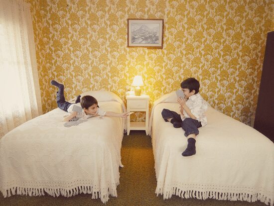
Hands down, my favorite addition to the wall (Scott’s favorite, too) is this photo of my baby brother Josh – taken seven years ago! I’m much older than my youngest sibling, and while home for the holidays moons ago, I photographed him in my grandparents’ home (you know, my favorite people ever?). I used to love nothing more than setting up photo shoots (family, friend or stranger – no potential ‘model’ was safe!), and I merged two photos to create a composite image of Josh; Scott was the one actually sitting on the other bed for each solo snap.
I chose this wallpapered room in my grandparents’ old house, as it was a room that I spent summers in playing Go Fish with my grandma, watching Bob Ross on television (yup) and helping my Pap Pap draw up signs for the church carnival. Looking at this photo – this room! – makes my heart swell, and it only took me seven years to bring my original idea to life. That baby brother? He just started high school this fall. (I included the original file below for a better look.)
So! Take two. A photo favorite, a wedding gift, travel snippets and a few collected prints breathe a little more life into this wall than version one. Sometimes, you just have to live with it for a while to see what’s not working, tweak, and make it right again.


That is so awesome. Love the last photo so much
It’s amazing how much better the mismatched frames work together than the matched ones. When figuring out this arrangement, did you do any virtual playing around to see what would work before committing to it? We’ve done that – taken a photo of each piece and of the blank wall, then made a composite in Photoshop so we can shift things around with a mouse before putting holes in the walls. Not very spontaneous, but I like to plan things out. :)
We use this method to figure out the wall: https://pinholepress.com/community/curate-install-perfectly-imperfect-gallery-wall/
It’s worked like a charm every time! Scott has suggested the Photoshop idea, but we haven’t tried that yet.
Fantastic frame arrangements, Kim! Of course I love the composite picture with Josh. So many great memories in that hiuse. Making the picture even better is that the picture on the wall within it is of Rocca Pia, Italy, where our family is originally from.
True! Looking at the photo, you can almost smell Pap Pap’s pizzelle cookies on the iron, can’t you?
This looks really good – such lovely contrasts and textures with the new composition. I love watching you carefully, deliberately piece this room together!
I have a “Pap Pap”, too! :)
Is it a Pittsburgh thing?! I also thought that was the norm until my friends were like, um, nooo…
Must be! I get the same response all the time. Haha
This looks really great! It looks and feels much warmer, in the sense that the gold color adds warmth, but overall, the variety I think reflects a warmth. In my opinion, when people do gallery walls with the same frames in the same colors, it feels stark and not very homey. I guess there is a time and a place for that kind of look. Anyway, I also think the eclectic frames fit well with your eclectic decor. Really nice job, you guys! :)
Looks so great! Now you’ve got me revisiting my frames!
Two questions: 1) where did you get your bouquet of billy balls, and 2) have you guys ever made a mat for a framed print as large as 48×36″? Any tips on that one?
Thanks! The billy balls came from amazon (dried already), and we’ve never matted anything that large… Prints that large typically stand alone pretty well!
I LOVE following your blog. Just thought I’d start this comment off with a bang! The wall looks so much more… for lack of a better word… fun?! The eye really attracts to that wall now… it doesn’t blend with it’s surroundings anymore! Nicely done!!
Thank you! And agreed… more fun!
Love it! It’s so much warmer and more interesting – the addition of different frames and prints somehow makes it easier to focus on the white framed ones you had up originally. I like seeing this evolution!
I love your blog, though I don´t have many opportunities to use your ideas, since where I live in Brazil our houses are built with bricks and we always have to use contractors. But I really loved the ideas of the mismatched frames, I was planning on doing something similar, and it was great to see both ways side by side. I´m definitively going with the mismatched ones. Thanks so much for sharing!
Glad to hear it! We definitely love gallery walls both ways, but this felt like a better fit in the living room.
Looks so great. Images are stunning. One of the best blog which i came across in recent times.
Hi! I’m trying to get a sense of the scale and proportion of your gallery wall (cuz it’s spot on!). What is the length of the wall and how big is your largest frame?
Thank you! The approximate length of the wall is 9 feet. The largest frame is 20″ x 24″. Hope this helps!