

This post is in partnership with Lowe’s.
When we nixed the crumbling white tile in favor of a warmer wood-look tile for the floors throughout the garden unit, we knew we’d want to complement that massive overhaul with fresh paint on every last surface, too. The current wall colors, while fine, feel a little too cool – especially for a below-grade garden! – but more importantly, the drywall was patched, repaired and written all over during the initial construction process. Small splashes of mortar, pencil markings and sanded down joint compound litter the walls, so one of the very last steps of this renovation will be a complete overhaul with paint. We get excited just thinking about it! The powers of paint never, ever fail.
Soon after we moved into our own home, we cleaned up this apartment and priced it accordingly before our former tenants moved in. They were looking for an inexpensive place to live in the city, with the idea that they’d be here for six months to a year and move on. None of us knew it would turn into four years, but with us being busy with our own renovations, it was a blessing in disguise. We’ve been able to put endless energy into making our home a place we love, and the timing of their move couldn’t have worked out better to dive into the garden apartment once and for all!
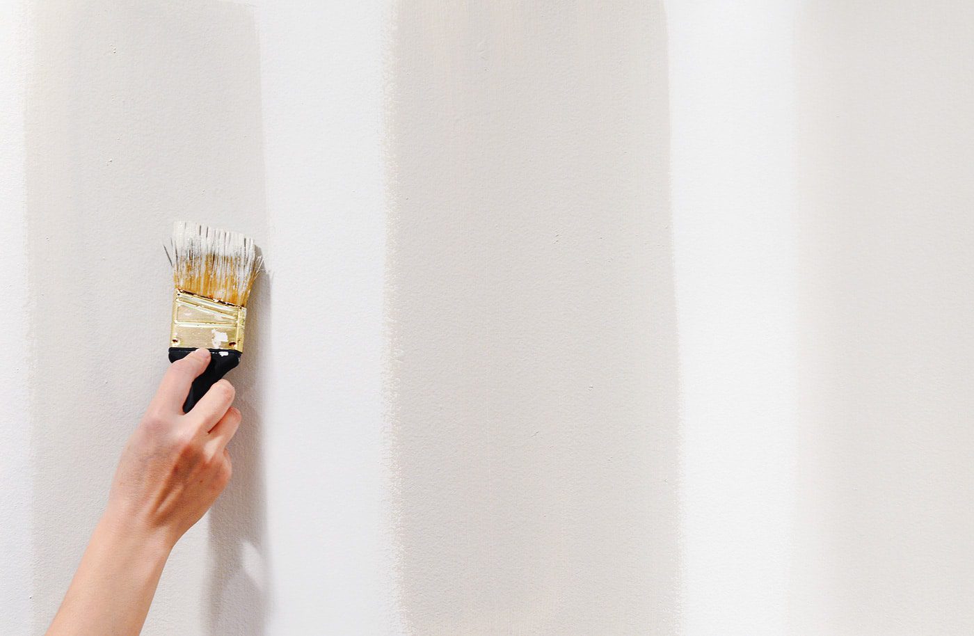
Although the walls in this unit were painted all those years ago, one thing we didn’t do was paint the ceilings, baseboards and door trim. We’ve been working with Lowe’s to choose the colors throughout the unit – you’ve seen Sea Salt in the laundry room and Ultra White in the bathroom – and now, we’re diving deep into choosing the perfect off-white for the living room, bedrooms and kitchen! After installing a whole ceilings of recessed LED lighting during the construction phase, this space is brighter than ever, and it can handle a warmer toned gray-slash-greige-slash-white. To kick off the decision making process, we rolled on big sections of Valspar Reserve’s Ultra White in an eggshell finish on several walls, the same color that will eventually be used on the ceilings and trim (we’ve already done the doors):
First, imagine those big swatches of white on the ceiling! We actually did a test swatch of the Ultra White on the kitchen ceiling, and it made their current state look downright dingy. The day that those first rolls of clean, white paint hit the ceiling is going to be an exciting one for the garden apartment!
Okay, ready to squint?
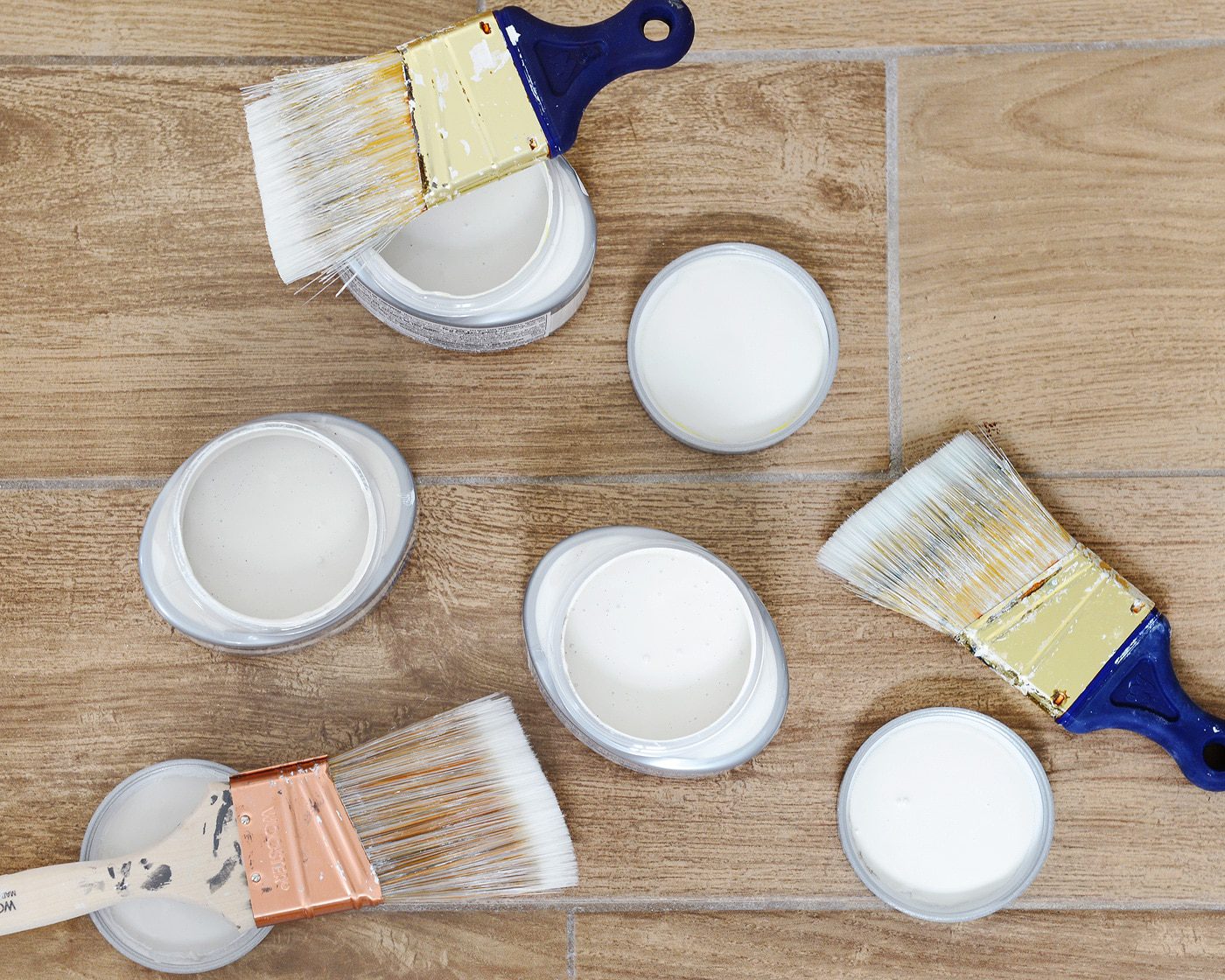
We grabbed close to fifty paint swatches of warm whites and grays at Lowe’s, and eventually, we narrowed those down to, like, twenty-ish. The top contenders were taped to the Ultra White, and as a group, we were able to immediately see the undertones of each. When placed all together, you can see the pink, greens, yellows and purples stand out from the crowd:
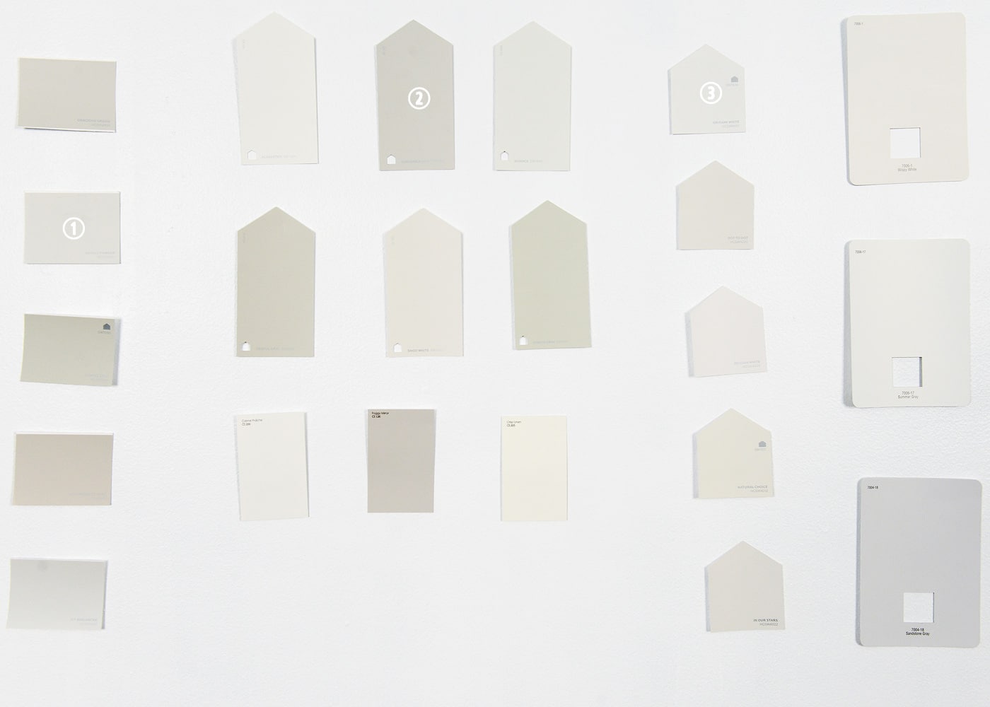
As we continued to work on other projects in the garden over the course of the following days, we slowly pulled off swatches, one by one, until we found our top three. Above, we have 1) Basalt Powder, 2) Agreeable Gray and 3) Origami White. While all of these colors are from the HGTV HOME by Sherwin Williams color line, we had them mixed to Valspar samples (just $3 each!) since we knew we’d eventually have the winning color mixed to Valspar Reserve. We’ve been using Valspar Reserve more and more throughout our home, and we continue to be impressed with its quality and coverage.
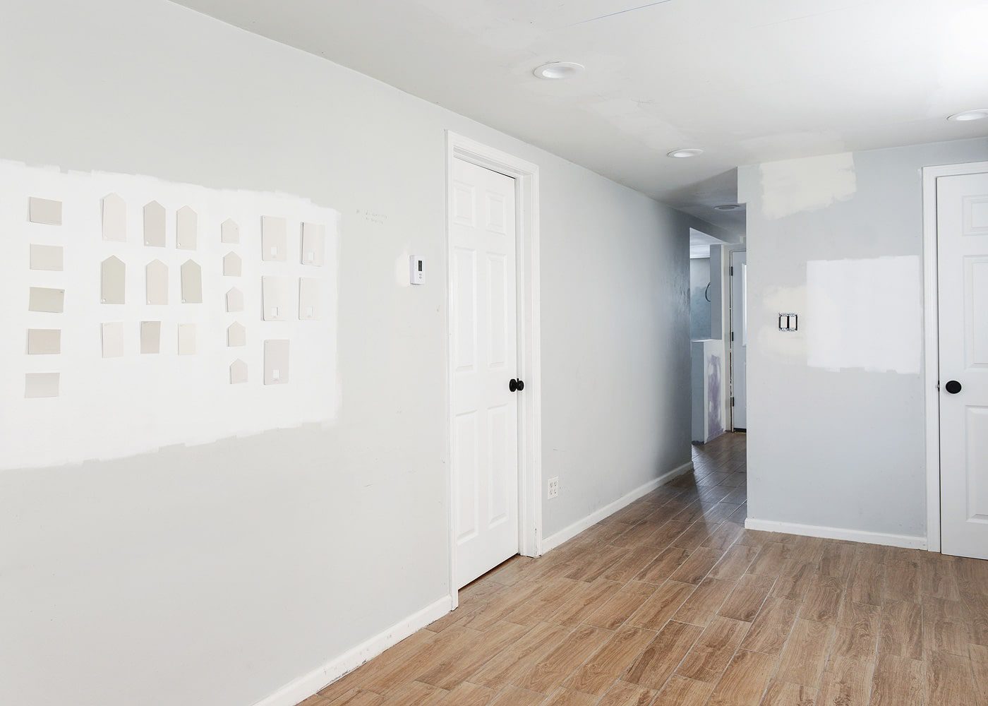
In the past, we’ve painted our samples on foam board and moved them around the room, but this time, we painted them right onto the walls. We chose three different locations, swiping the samples on areas that get light from the south and west, and one corner that doesn’t get much light at all.
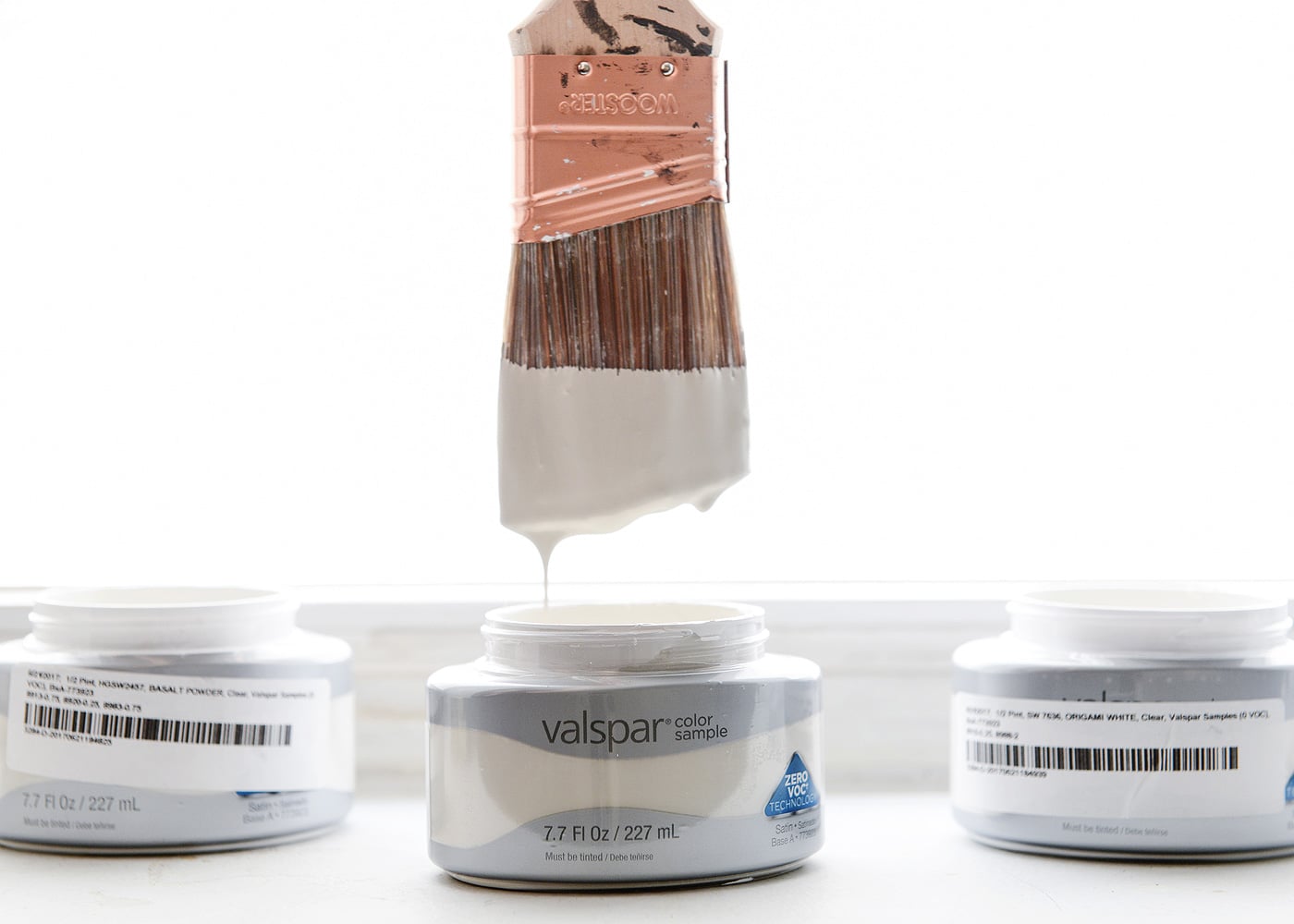
Before the paint had even dried, we both pointed to our favorite. We scrutinized the three colors in both natural and artificial LED light, and in both cases, we were sold on Basalt Powder. It was the clear winner! Above and below, from left to right: Basalt Powder, Agreeable Gray, Origami White.
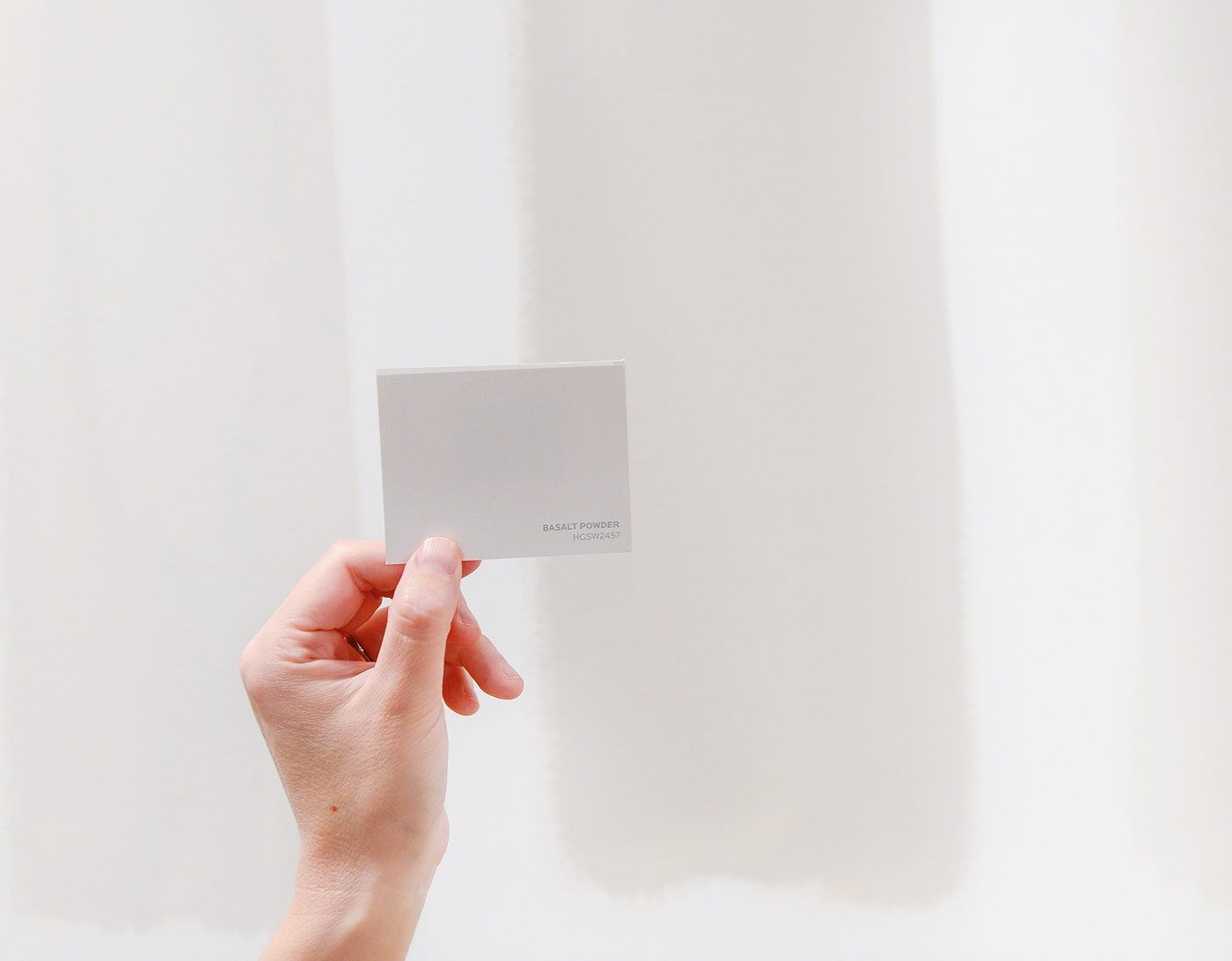
Basalt Powder felt like the happiest marriage of gray and white, with more than enough contrast to pop off of the white trim. We’ve tossed around the idea of having it tinted at 50-75%, lightening it just a touch more, but of course we’ll let you know how that goes if we choose to do so!
With one more decision knocked off our list, we’re feeling more excited than ever about the direction of this apartment. We spent the 4th of July weekend up to our eyeballs in kitchen cabinets, and we’re weeks away from sticking a fork in this guy! Is it too soon to start counting down? We just can’t help ourselves.


Hey Kim and Scott! It’s kind of funny, but I think I’m just as excited as you two to see how it turns out! Thanks for sharing :)
Haha, happy to have you along for this crazy ride!
Picking out a paint color, always one of the hardest and longest tasks of decorating a room! I have more paint samples in my basement than you can shake a stick at. Glad you got it pinned down!
Once we choose a color, we immediately donate all the samples – the last thing we want to do is second guess ourselves, ha!
I dump all of my samples into a gallon paint can. It ends up a medium grey that I use as primer for smaller projects.
That’s such a great idea, Loryn!
We painted our entire house a shade of grey that I loved in one room, that I basically hate every where else. Such a good lesson learned in the power of paint swatching.
Paige
http://thehappyflammily.com
I live in a walk-out basement apartment and when we moved in it was painted WHITE, like un-tinted white paint haha and it looked so blue and horrible! we ended up going with plaster of paris by benjamin moore which i was worried would come across as yellow but it’s the perfect creamy white :) crazy how lighting works!
Lighting is everything with paint! Had we not added so much recessed lighting to the ceilings, there’s no way we’d go as light as we are. Instead of being bright and warm, it would have looked dingy and dirty.
Thank you so much for this! While I’ve been following your blog forever, I’m especially interested in the garden apt. rehab. I currently live in a garden unit in Bucktown which until new owners took over a few months back, I was not permitted to paint! Fingers crossed that I’ll be able to renew my lease within the next few weeks and be able to get a refresh (after 8 years!) If not, let me know if you’re on the lookout for a quiet and responsible, mid 30’s renter with a mini schnauzer!
I would have bet You were gonna go with the Oragsmi White. All three are amazing colors and I can’t wait to see the finished product.
Right?! We like how light Origami White is, but like the tone of Basalt Powder the best. I think that’s why we might tone down Basalt just a bit and only get it tinted at 50-75% instead of full strength. Can’t wait to see this go up on these walls!
What a great idea.
I just want to thank you for pointing out the trick of tinting paints at a lower percentage – I had no idea that was an option until you mentioned it (I think I first read it in the garage posts?) but it’s helped me SO MUCH with painting my house. Because the lighter colors on the swatch aren’t always right! I recommend this to everyone now if they’re having trouble, so thanks for the tip!
So happy to have helped! Yup, we did that in the garage, and our hallway paint color was done the same way. But you’re so right – the next color down on the swatch isn’t always the right tone, so better to choose the right tone and have it mixed at a lower percentage.
This kind of process is so helpful to see! Thanks for documenting it all. I’m looking forward to this reveal!
Question: what size are the pot lights in the garden apartment? We’re about to put some in our basement, and are debating between 5″ and 6″. Thanks!
They’re 6″ LEDs in soft white (2700k), and we couldn’t be happier.
Perfect! Thanks!
And do you have 6″ upstairs too? What do you think the difference is with 5″?
Yup, 6″ upstairs in our home as well! To be honest, I’m not sure what the difference is, but the 6″ seemed to be a readily available standard at our local hardware stores.
Gotcha. Yours all look great, so that seems simple enough. Thanks!
THANK YOU for posting about Lowe’s (grey) paints! I’ve been searching for the perfect “light grey” for about four months. Who knew how hard it was to find the perfect grey?! I went to both Home Depot and Sherwin Williams, tested SEVEN colors in about ten spots (my walls currently look like a grey patchwork quilt), and almost settled for “Site White” by SW. When I read your blog I thought, “Why not give Lowe’s a try? Yellow Brick House had some pretty good paint chips on the wall.” I stopped in the other day and grabbed two more samples, bringing my grand total to nine.
I’m extremely happy to say I found my perfect “white grey” with Glacial Stream at 50%. No purple tones, no blue tones, no tan tones, just perfectly grey. Thank you again for posting such a simple reminder! It saved me from settling for a wall color that I didn’t love!
Awesome, so happy to hear!
Hey Jenny! Could you email me a picture of the glacial stream at 50%? I’m possibly wanting to use that swatch in my home, but am wanting to see different tones of it first!
Looks sooo good!! Did you end up toning the Basalt Powder down by 50% or 75%? Or did you go full strength? Also, what color is your trim, doors, and ceiling?
Hi, did you end up tinting lighter than full strength, and what was the deciding factor for basalt powder over origami white?
We ended up tinting the Basalt Powder to 75% strength. It was just what looked best in the natural light in the space.